top of page
Logo design for a reading event
Design. "Velvet Tongue" was a new event series from the publisher, Little Raven (a former erotic fiction publisher in Melbourne). Erotic fiction writers would read their work on stage, into a microphone. The events would feature performances from published writers but there would also be an open mic opportunities. The performances were mostly humerous and relaxed. People would attend to listen to performances, meet writers and chat.
The Velvet Tongue logo required a sense of humour and to intertwine with the Little Raven logo, with a sense of what the event was and what the subject matter was.
Project type
Logo design
Date
2013
Location
Melbourne

01
Logo design for a reading event

01
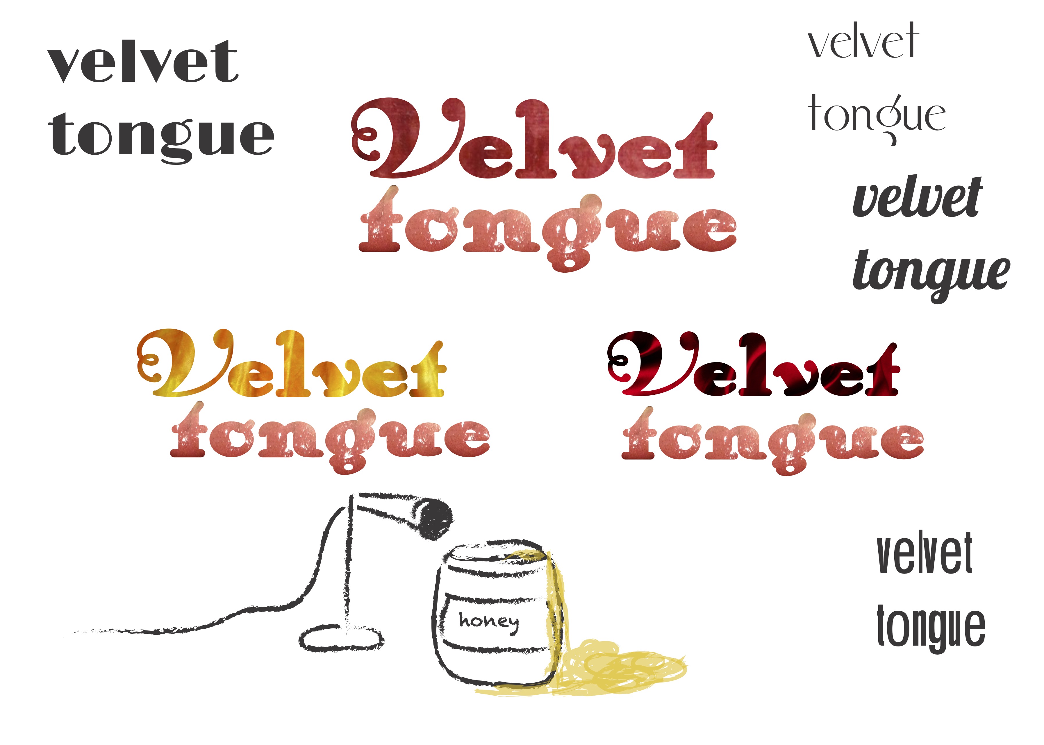
Velvet tongue – exploration
I explored different font and textures and shared with the client. Some sketches of ideas I could expound on if desired.
The font style we were looking at was art deco inspired, that 1920s period of liberation and elegance. For simplicity, we tried simple black font.
I explored textural masks behind the font as well, velvet and tongues – both visceral and erotic without being overly sexual.
The font style we were looking at was art deco inspired, that 1920s period of liberation and elegance. For simplicity, we tried simple black font.
I explored textural masks behind the font as well, velvet and tongues – both visceral and erotic without being overly sexual.

02
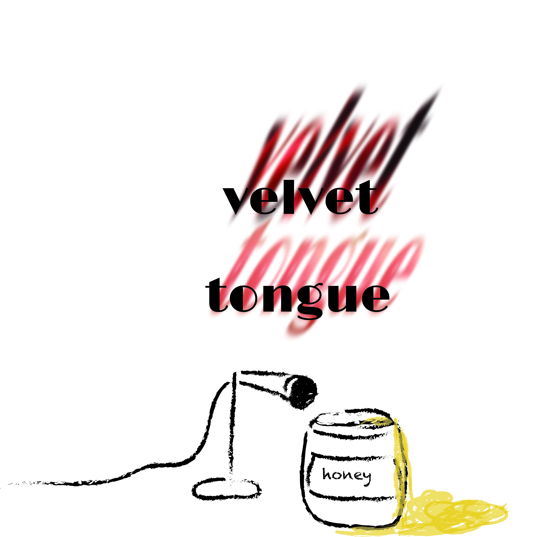
Velvet tongue – a tub of honey was not sitting in the right genre
We also discussed incorporating honey into the design, to represent smooth talking and sensual play. The design I used we realised reminded us of Winnie the Pooh, which was not on-brand. However, the microphone was something we both thought represented the event itself.

03
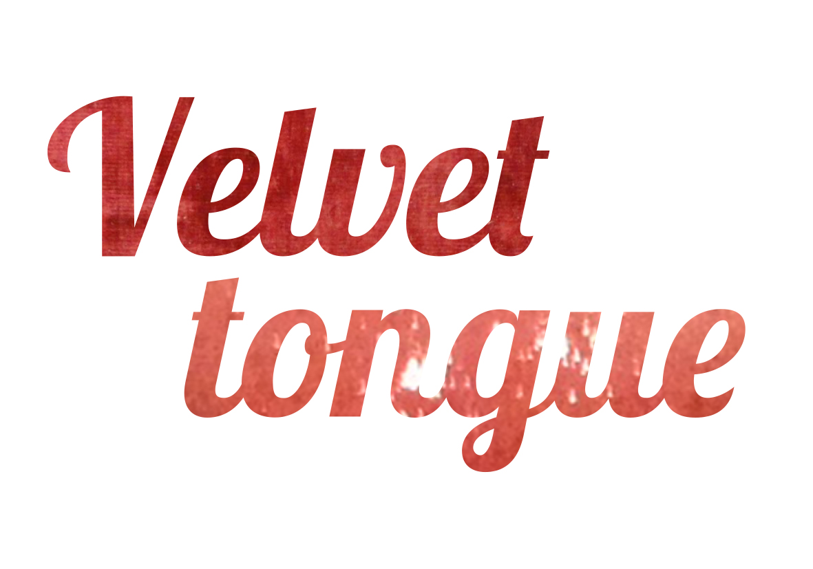
Velvet tongue – the font we liked and the texture
The masked design using textures to represent the words. Although we both liked this design, we decided it wasn't entirely clear what the texture was. We felt that its visceral nature was more grotesque than sensual.

04
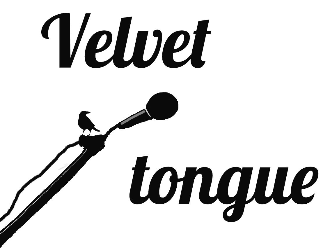
Simple black text, a microphone and a raven
Shifting back to the microphone, I drew a simplified microphone. (Note: I was using Photoshop in 2013 so it is not as good quality as it would be now.) The raven was already designed and part of the publisher's logo, so I placed it on the microphone. To me, this represented that the publisher was there for the writers, to support them as they read their work.

05
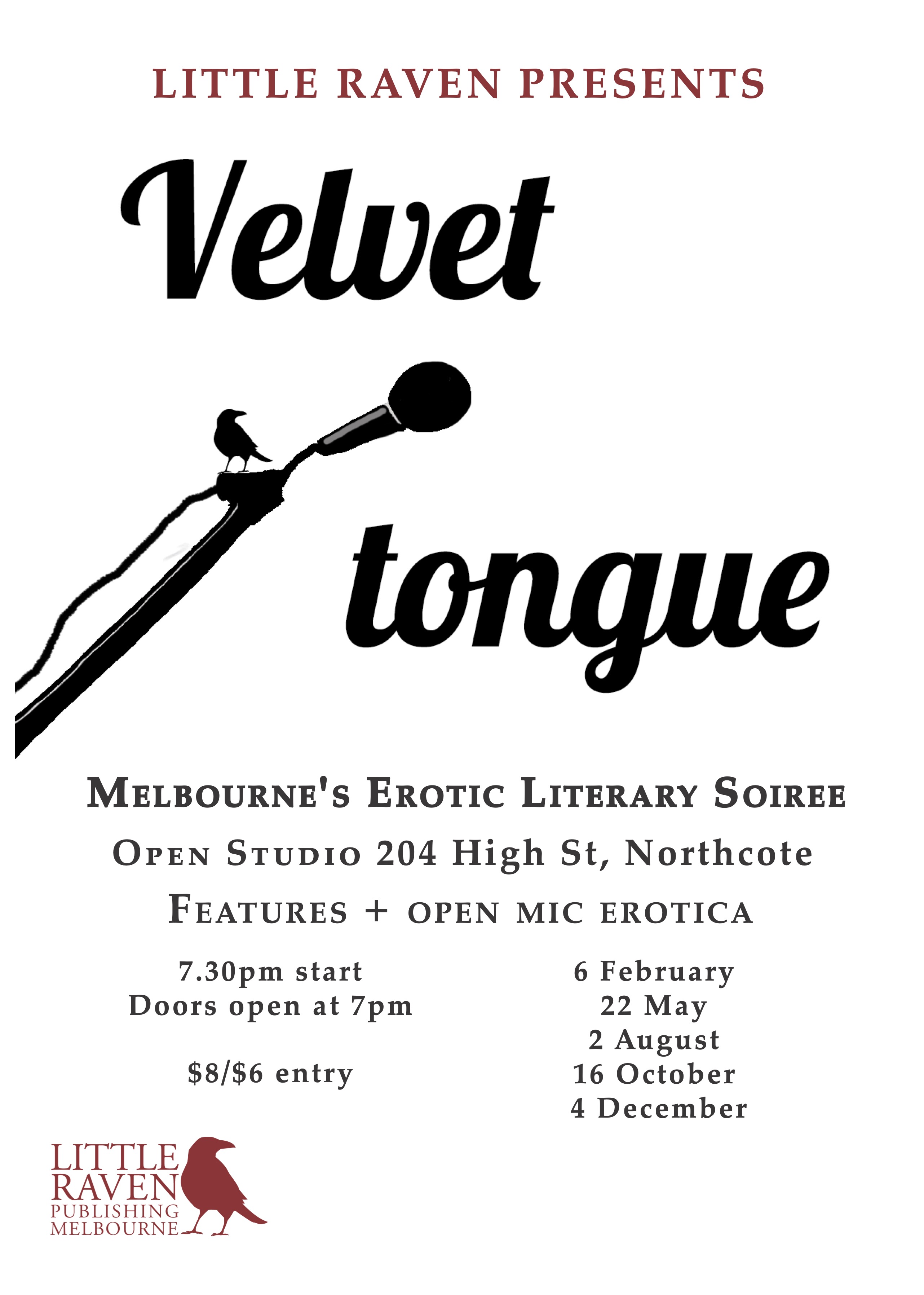
Velvet tongue – final poster
The poster used for the series incorporating the logo design.
- "Velvet tongue" repeated in different fonts and designs. Some with different coloured velvet used as the font background and some with a tongue as the font background. There's also a sketch of a microphone and a tub of honey.
- A design of the words " velvet tongue", the font with shadows using velvet and a tongue. Sitting above a sketch of a microphone and a tub of honey.
- The text "Velvet tongue" with the letters using a pink velvet texture in the background and the tongue using a tongue texture in the background.
- The text "Velvet tongue" and a drawing of a microphone in a stand and a raven sitting on top.
- The Velvet tongue logo design placed on a poster with details about the event and the publisher's logo.
bottom of page